As the UX/UI Designer, I spearheaded the end-to-end redesign of FLIT Invest’s mobile platforms. The primary challenge was a 92% user perception of "outdated" branding which directly impacted user trust and deposit rates. By overhauling the information architecture and visual language, I streamlined the "money-in" flow and improved transparency in impact tracking.
The Problem: A Crisis of Trust
FLIT Invest had a technical product that worked, but a design that didn't. Our research identified three critical business blockers:
Before rebranding
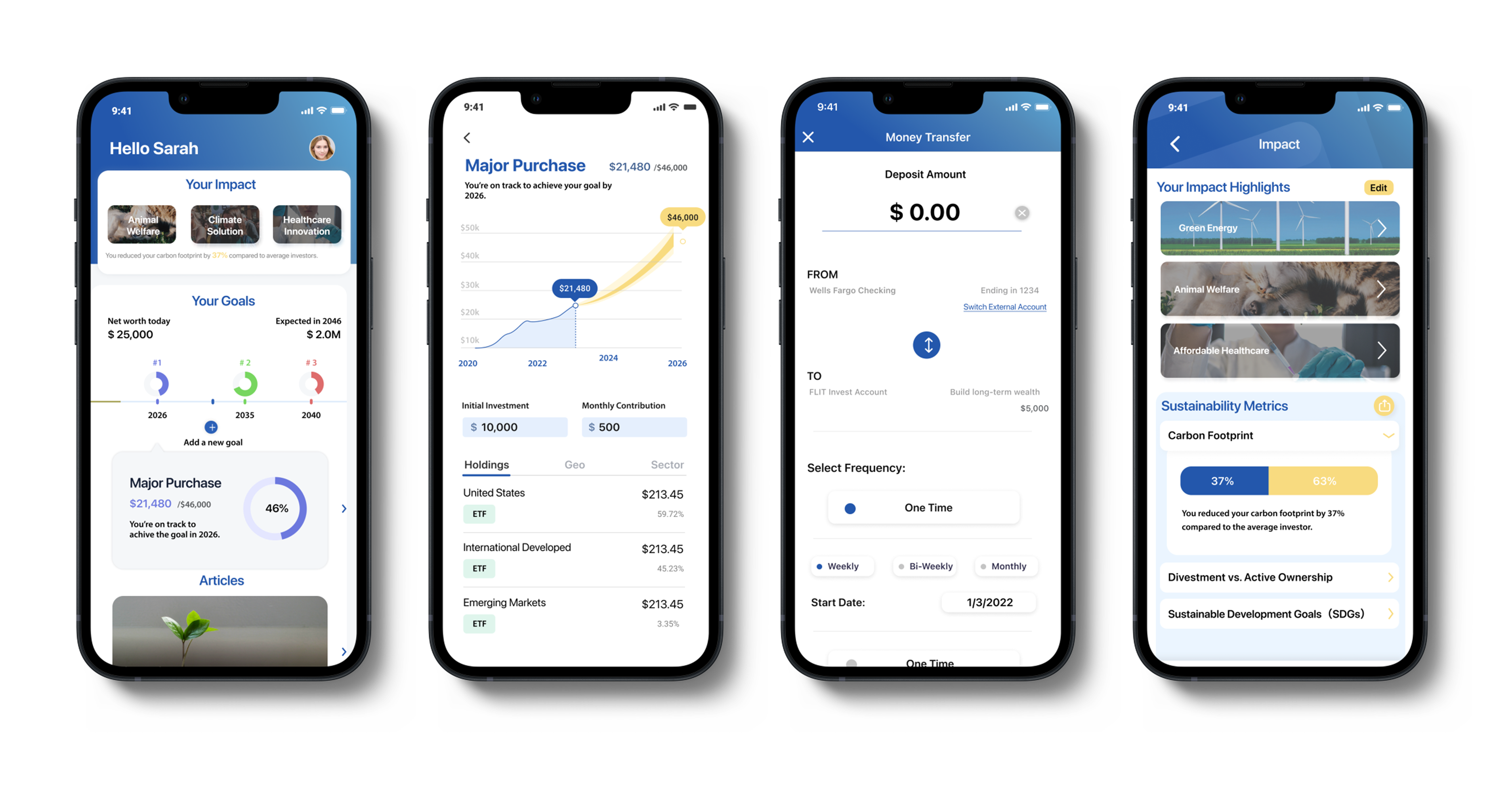
Before Redesign (FLIT Mobile)
The Strategy: Designing for Clarity
I moved the project from "making it look better" to "making it work faster."
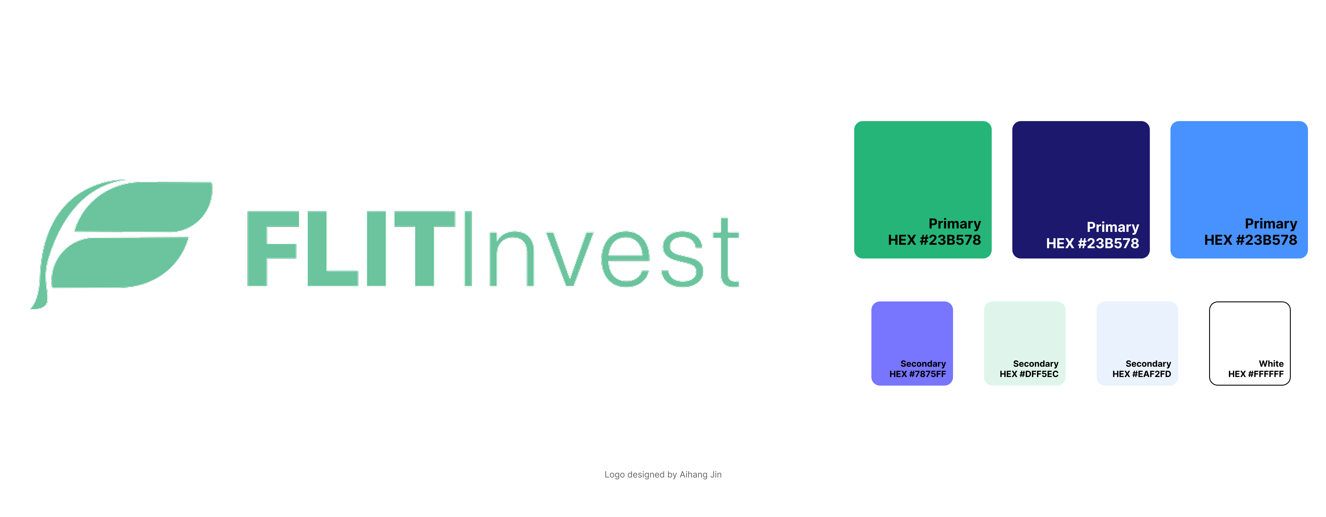
After Rebranding
After Redesign (FLIT Mobile)
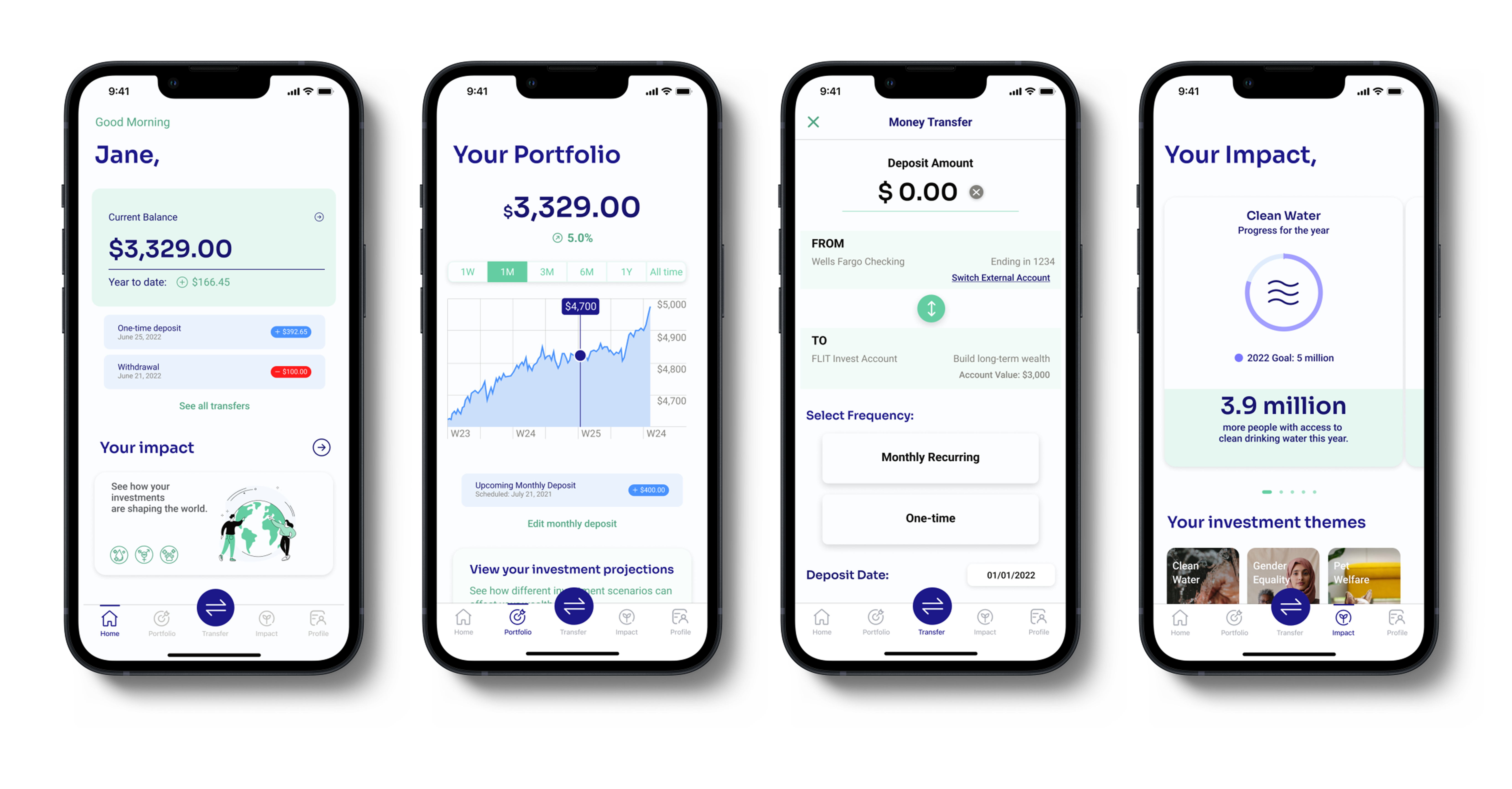
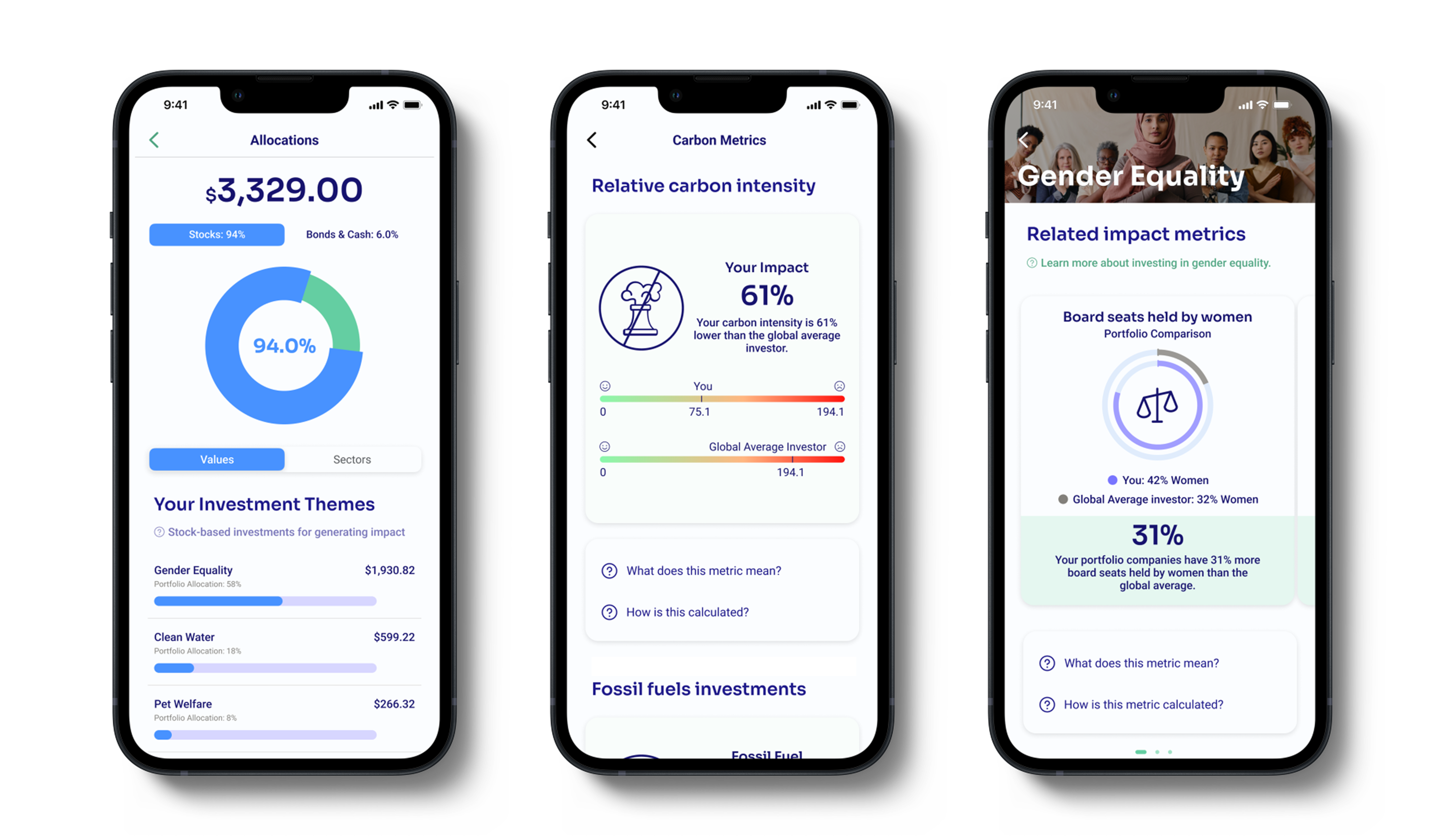
Challenge: Designing for "Sustainability" is often vague. Users didn't feel like their money was actually doing anything.
Solution & Trade-off: We debated between showing deep technical whitepapers vs. high-level summaries. I pushed for a Circular Progress Impact Bar. It sacrificed deep technical data for immediate emotional feedback—showing users the "yearly impact" of their dollars at a glance. This trade-off significantly improved user sentiment in follow-up testing.