The Problem: A Crisis of Trust
By 2022, the original 2020 brand identity was no longer fit for purpose. Through audit and stakeholder feedback, we identified three core issues:
- The existing visual language did not effectively communicate "trust" or "innovation" to a sophisticated audience of young professionals.
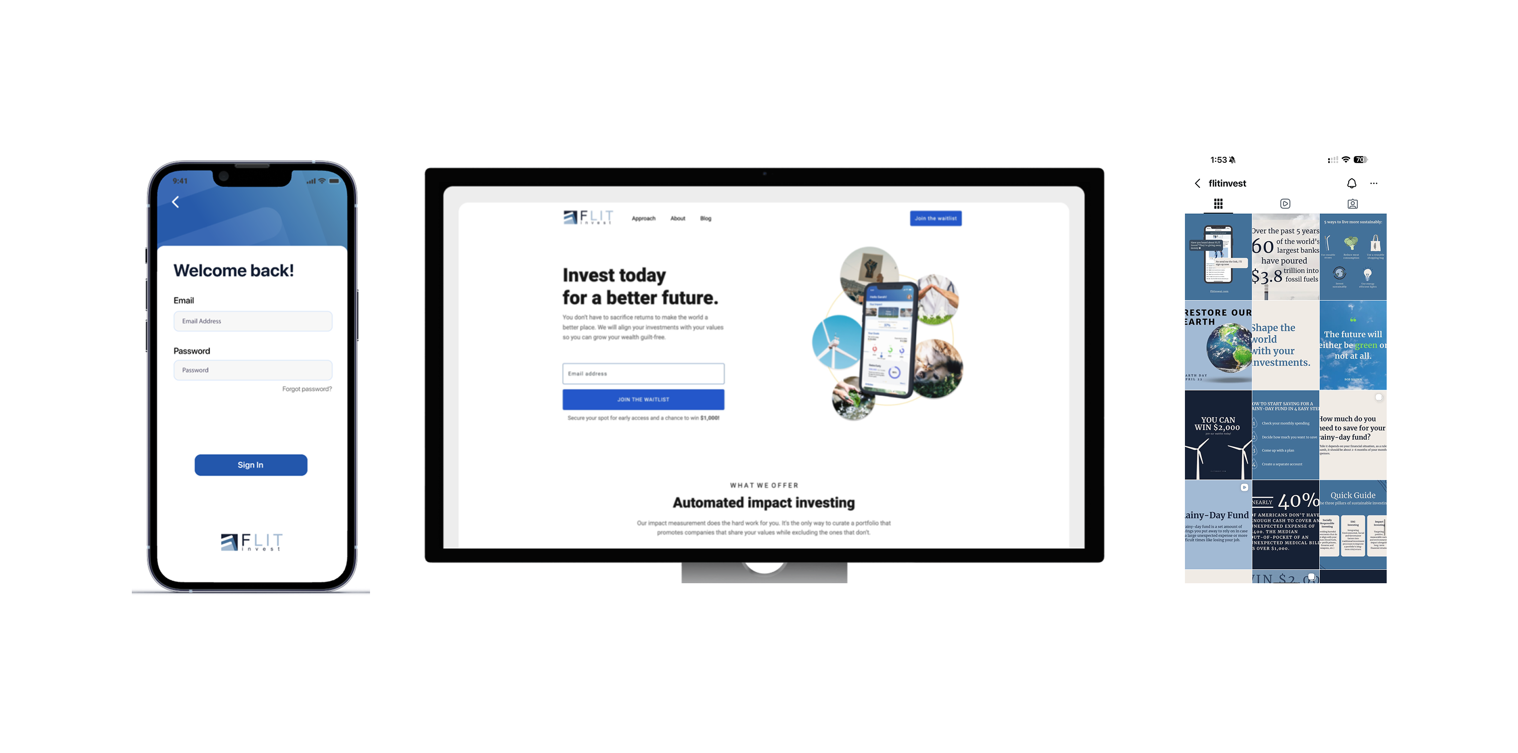
- The legacy website and app lacked a unified design system, leading to fragmented user experiences.
- There were no brand guidelines, making it impossible to create consistent marketing assets to meet high demand.
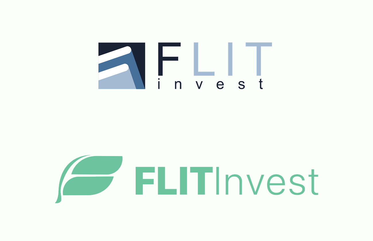
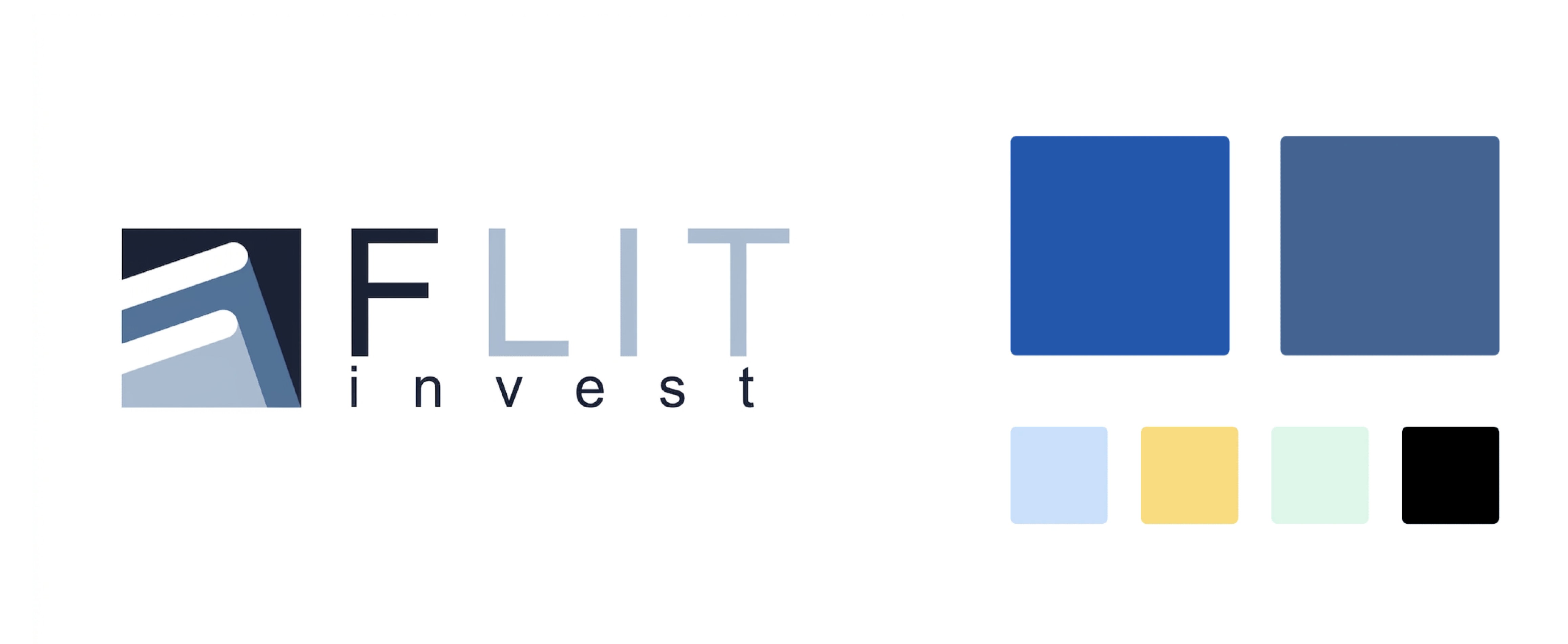
Before rebranding
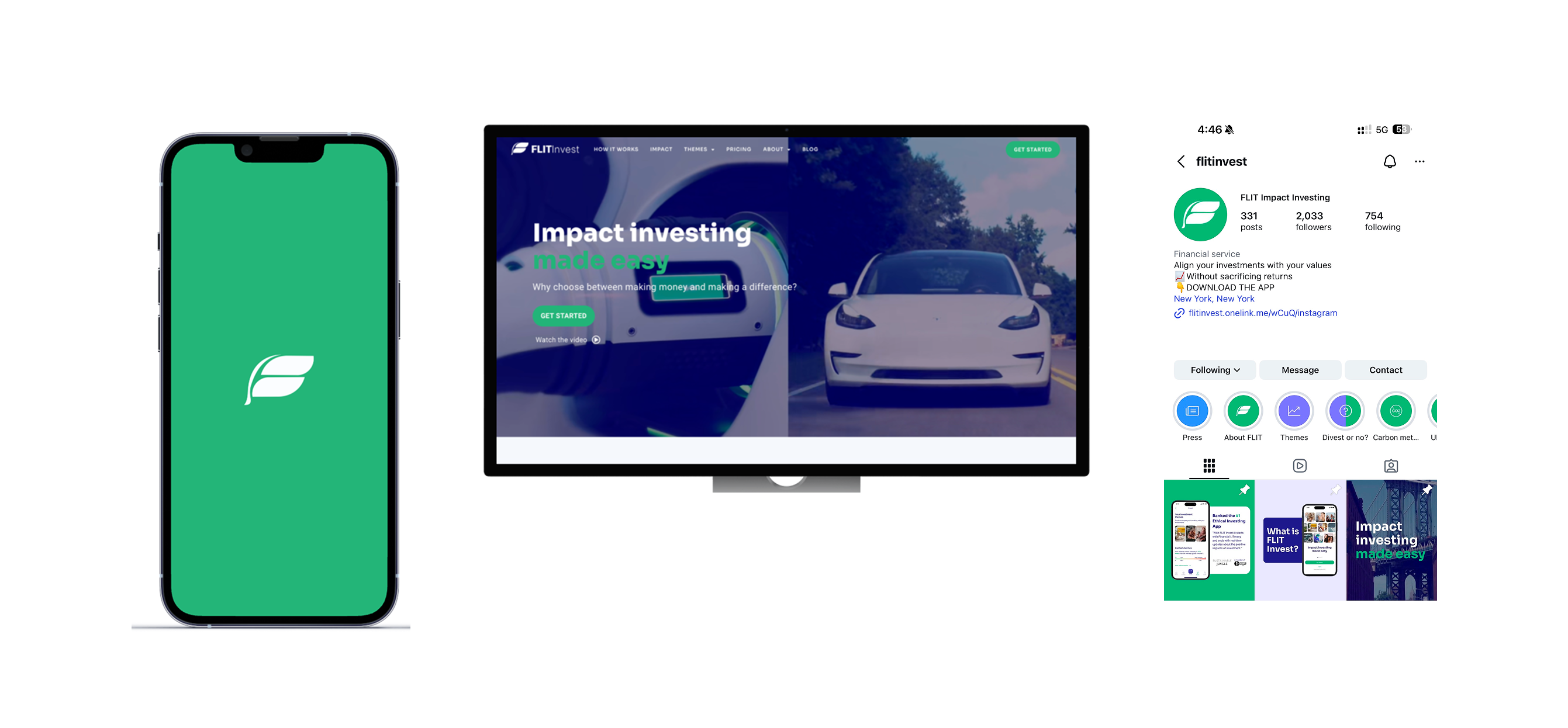
FLIT Invest Apps + Social Media
The Solution: A Sustainable Visual System
We built a new visual identity from the ground up to reflect progressive values and simplicity.
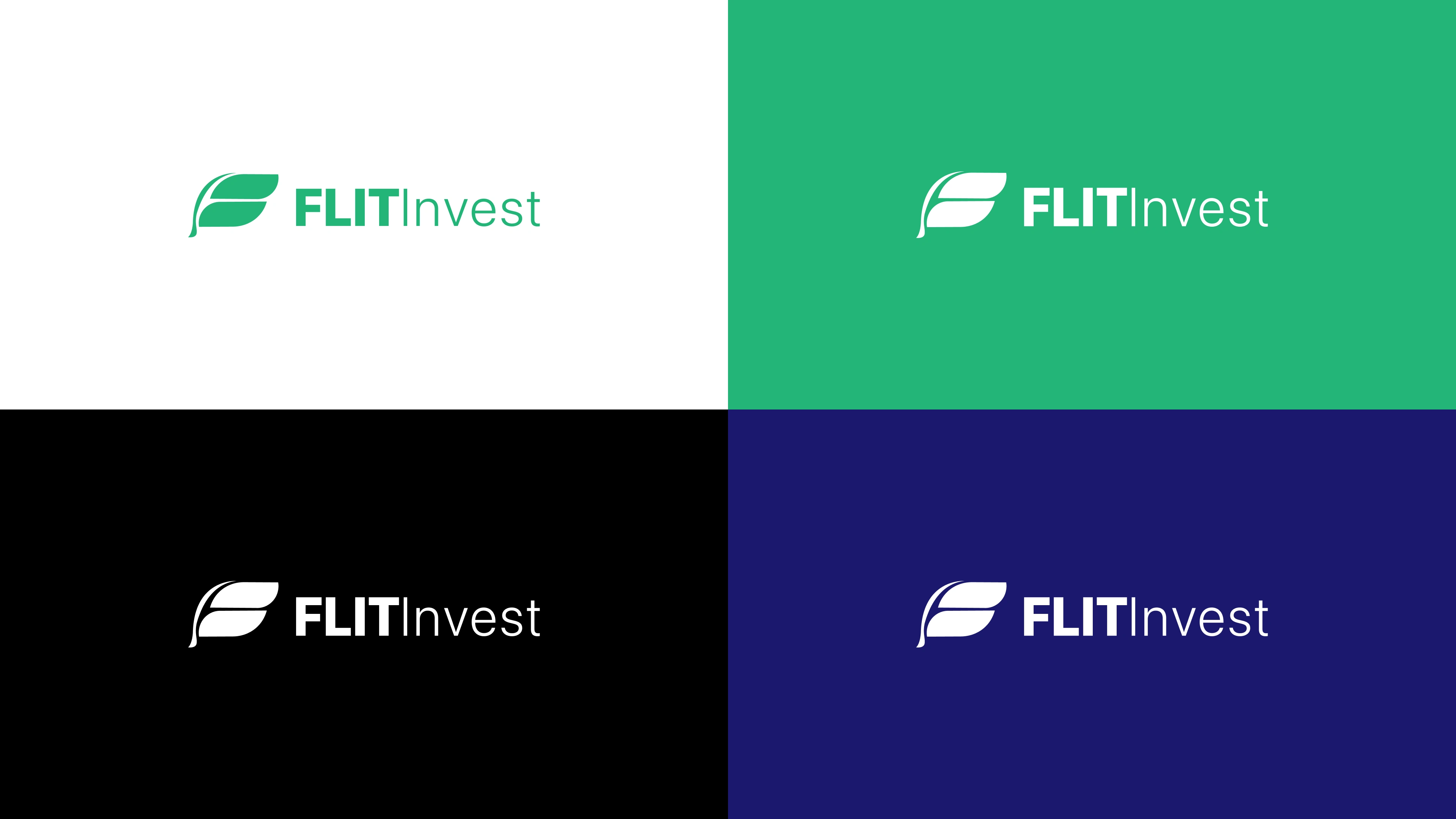
- Designed a clean, modern logo representing forward movement and innovation.
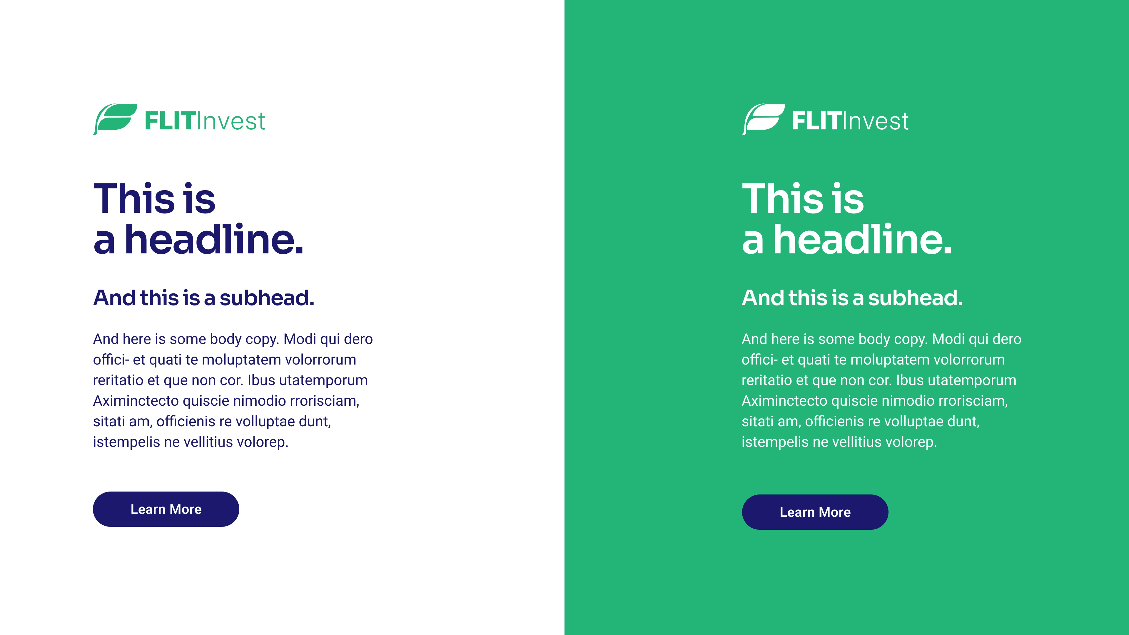
- Updated font library features Sora for headlines and Roboto for body copy, effectively blending a forward-thinking visual style with mobile-friendly legibility.
- Developed a vibrant palette of Green, Dark Blue, and Blue, combined with a minimalist black-and-white framework to balance boldness with dependability.
Rebranding
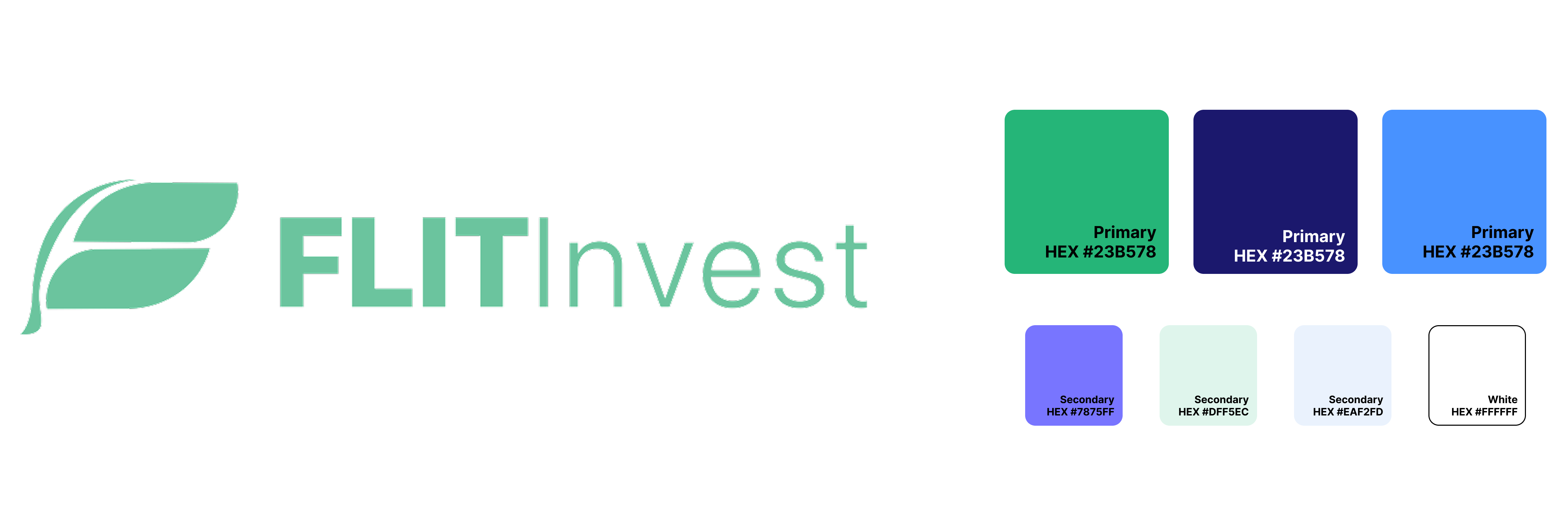
New Logo
New Font Library
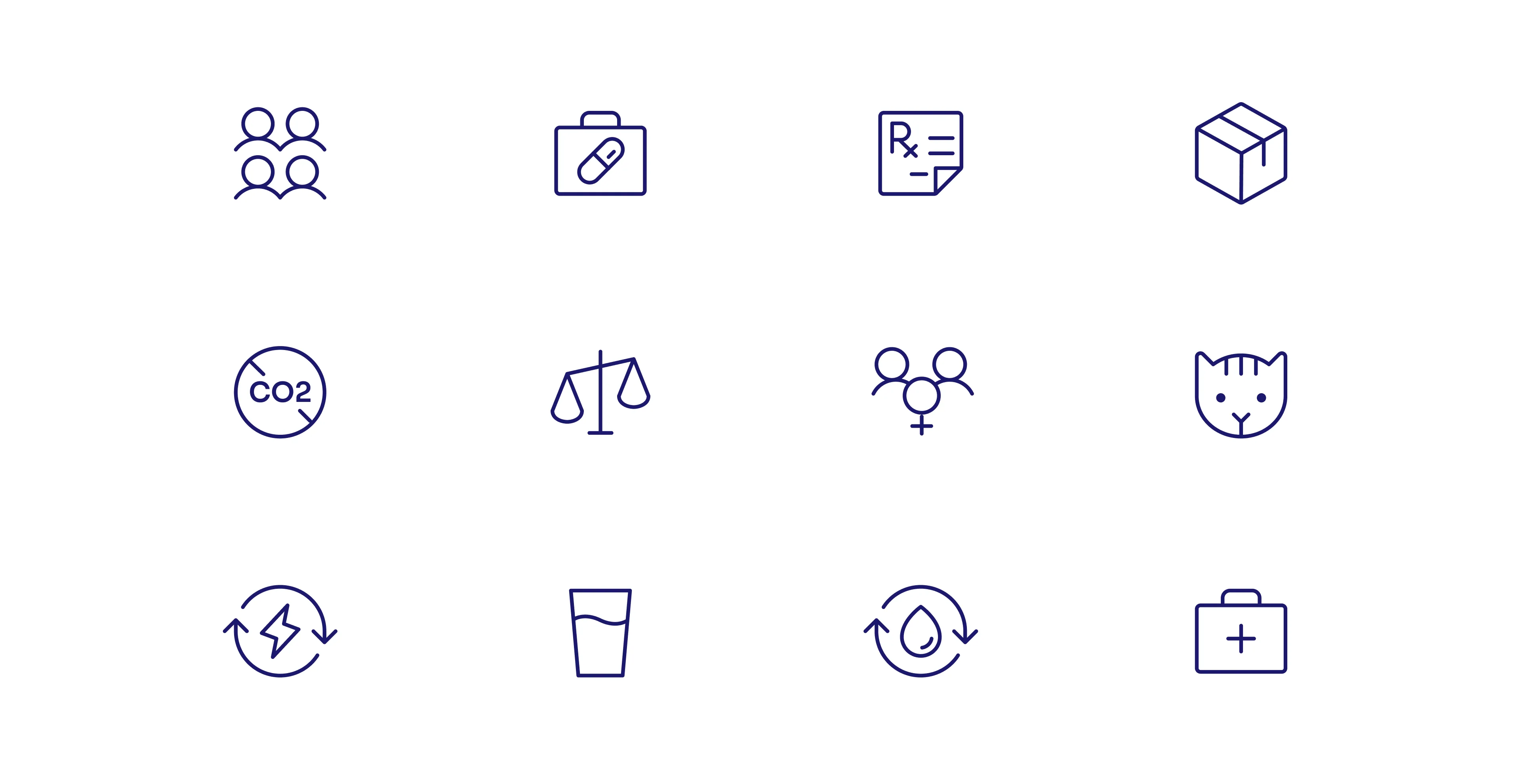
New Icon
How it applies
Challenges & Overcoming Obstacles
- Striking the right balance between being a bold, innovative startup and a dependable financial institution.
- We utilized iterative user testing and stakeholder feedback loops. By grounding our "vibrant" color choices in a "minimalistic" layout, we were able to signal modern tech while maintaining the professional feel required for a trusted investment platform.
Outcome
The refreshed brand identity successfully positioned FLIT Invest as a rising leader in the competitive fintech landscape.
- The new system serves as the single source of truth for all current and future website and mobile app updates.
- The identity enables the company to lead a new era of accessible, impact-driven finance.